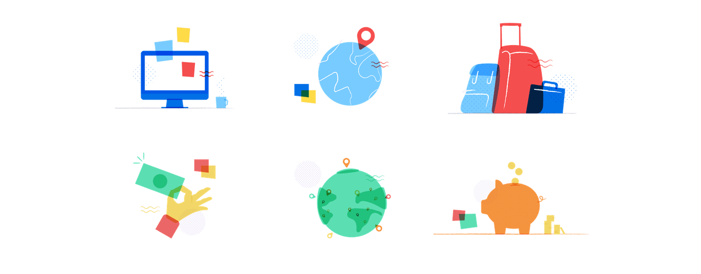
We scale high-growth start-ups
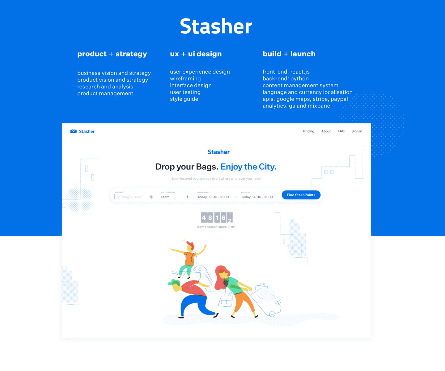
We were Stasher's product team helping them transition their product offering from a beta website to modern web and mobile apps built on a scalable platform created from the ground-up to support growth. This empowered them to raise an £850k investment round and deliver a 300% increase in revenue in just six months post-launch.
Introduction
Stasher initially approached us to perform a complete product audit. They worked in the same space as a company we provided some development support for, so we knew everyone involved in the day-to-day business, and would occasionally chat about the product journey they were on.
Stasher - then known as CityStasher - is a convenient, safe, and affordable alternative to luggage storage lockers and station left luggage facilities, connecting travellers with hotels and shops that keep luggage safe, enabling them to freely enjoy their time in over 100 cities worldwide. When we first engaged with them they had a presence in major UK cities and were just stepping onto the global stage with their first locations in Paris!
Stasher were an entirely online platform connecting travellers that want to "stash" their bags and "StashPoints" - physical locations like hotels and shops that people could leave their belongings at safely, so having an easy-to-use online experience for both customers and service partners was a key ingredient in their future success. The website wasn't just a tool to sell the product, it was the product.
A year before we started working with them, they purchased and implemented an off-the-shelf platform and made some tweaks to it to suit their requirements. This worked adequately enough to get them off the ground, but their needs as a business - as well as those of their rapidly increasing customer base - were starting to outgrow the restrictiveness of this solution.
Strategy
Realising this, shapelabs were brought in to help them quantify the limitations that their current solution had, how it affected (or may affect in the future) their business, and how they might go about adapting themselves and their approach from a product and technology perspective.
We began by seeking to understand everything we could about their existing business and what the plans were for the next six, twelve, and thirty-six months. This gave us the context to determine how we should focus our time in order to uncover the real challenges and what the options might be to solve them.
Part of this initial process involved creating a product roadmap, which entailed doing extensive user research and spending time with all key staff members, customers, and hosts to understand what they used in the current system, how they used it, what they liked / disliked, and getting an understanding of what would make their lives easier.
From that research we created numerous user stories which we then categorised into epics/themes related to their wider business objectives. For example, we had themes around increasing conversion, increasing customer satisfaction, maximising internal efficiencies, etc.
The report we gave Stasher covered current technology, people, and processes, as well as providing a foundation on which to determine their future product strategy and resourcing. This would prove to be a key input in their pitch to raise their planned Series A financing.
Based on the report (and closing in on the financing) Stasher asked us to act as their product team with the first task to redesign and build their platform from scratch - both backend and frontend.
Design
Userflow
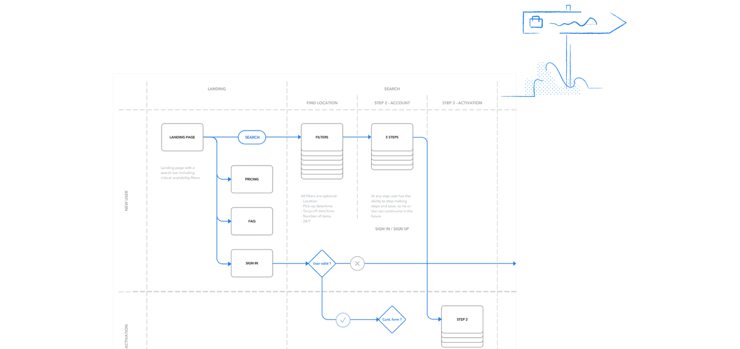
From the user stories we produced as part of the report we had a very good understanding of what a revamped platform would be required to do and how real users (employees, "hosts", and customers) would need to interact with it. We began the design process by translating the user stories we had collected into a user flow to help us visualise the paths each user would follow through the website and mobile apps.
The core objective was to make the core user journey as easy and intuitive as possible. We knew from Stasher's existing analytics that many of their customers booked using mobile devices whilst they were travelling (in fact, a large proportion of customers were booking the same day!) so it was critical that the mobile experience was front of mind.
Wireframes
Before designing the wireframes we performed a "Google Brand Sprint". This enabled us to all be on the same page, and it aided us in making the big decisions that need to be made when designing user experiences and interfaces.
The branding exercise brought the team together to define the what, the how, and the why of the company itself, as well as it’s audience, values, and personality.
At shapelabs we like to look at the product holistically across the entire customer lifecycle of acquisition, conversion, and retention and delve into the detail of each process and how users feel at each step of the process.
“Designing for trust” was a key focus throughout the process but especially with regards to the "acquisition" and "conversion" elements of the customer lifecycle. Stasher are excellent at proving their trustworthiness once used after all, so "retention" wasn't our core focus at this stage.
When offering a new service that involves customers trusting it to look after their possessions, that service is asking them to take a huge leap of faith. Our role as designers is to make that experience as reassuring as possible, and to show that other people just like them have used (and even loved using!) the service, and that nothing that they may be fearing will happen.
We achieved this by employing a number of techniques:
- Making the product aesthetically pleasing. It's been proven that a well designed, aesthetically pleasing interface that works as expected with no surprises is deemed to be more trustworthy. Nielsen Norman describes this phenomenon as the ‘Aesthetic-Usability’ effect, in which visually appealing things are generally perceived to be easier to use and are more likely to encourage users to try it compared to less attractive products.
- Using "social proof". Social proof in the form of customer quotes, ratings and reviews, when used effectively at the right customer touchpoint, has been proven to drastically improve online conversions and build the overall credibility of your product.
- Using what is referred to as “borrowing trust”, using familiar brand names. For example using Feefo as a trusted review partner and showcasing brand names that have featured or partnered with the service.
- Displaying accountability. Thorough insurance, terms and conditions, as well as privacy and copyright statements, help to show users that the company takes the service and its users seriously. By also using live chat on their site connected to a dedicated support team, users gain confidence that there are people involved in the process and can help them swiftly resolve any issues that might occur.
- Ensuring there were no surprises in the process or interface, making sure that the site assists and guides them through the booking process and offers appropriate feedback.
- “Designing for delight” with fun illustrations with personality.
From the user flow we created wireframes to further define the navigation and hierarchy of content and functionality based on the user's (customers and hosts) and business' needs. This gave us an early feedback mechanism we could deploy to test with user testing groups.
The mobile version of the webapp had to feel effortless to use, as we knew that over 40% of all customers booked using their mobile. In particular, at the key service touchpoint of the physical bag dropoff / pickup itself - which impacts both customers and hosts - mobile usage of the webapp was close to 100%!
As a consequence, we spent considerable effort designing and testing the mobile experience in order to ensure that it was as close to optimal as possible.
Key Interactions
There were 3 key areas of the user interaction that we focused on:
Search
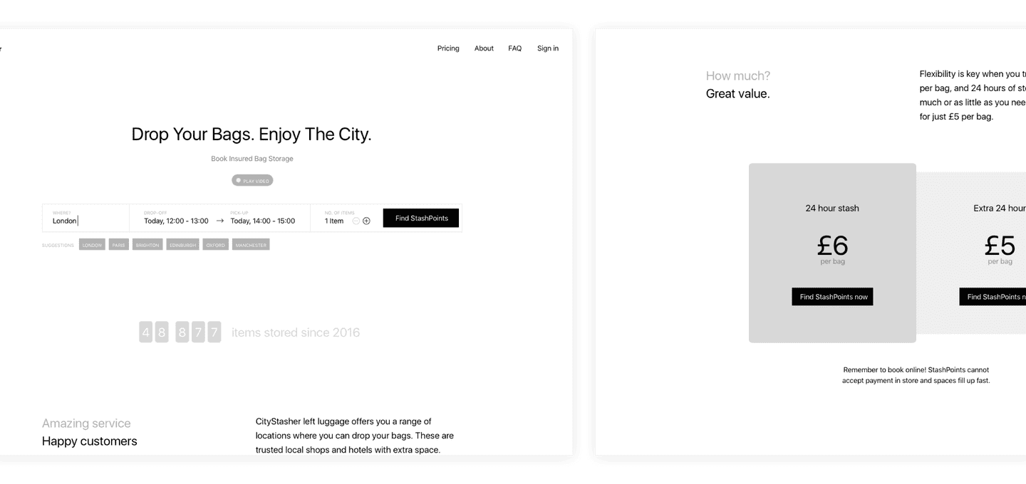
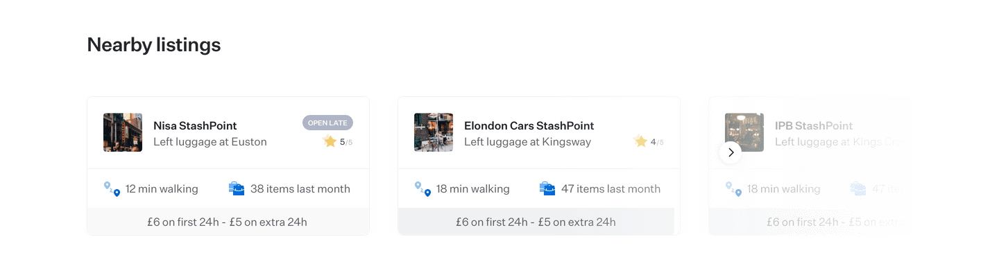
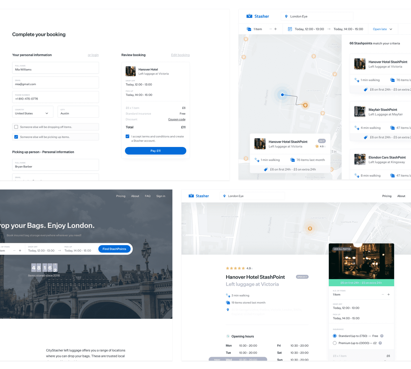
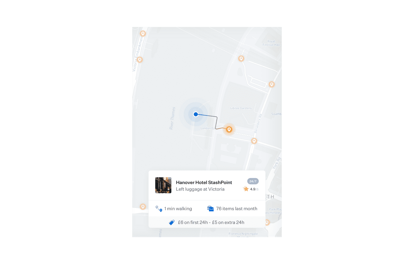
Finding a StashPoint is the very first interaction a user has as they begin the core booking flow, so we wanted to make this as slick, easy, and intuitive as possible. To achieve this, we designed a large text input that would suggest popular locations (such as "King's Cross St. Pancras") as a user types, as well as the ability to allow us to access their current location in order to quickly find StashPoints open near them.
When a user makes a search we show them StashPoints on a map centred on their search, and list the StashPoints ordered by their proximity or popularity.
A user can also filter by date / time for drop-offs and pick-ups - much in the same way as you might when searching for flights - in order to find a StashPoint that will be open and have availability when they want to drop-off and pick-up.
One important piece of feedback that we got from the customer support team whilst getting to the bottom of the challenges they experienced in their everyday work was that bookings made on the previous platform appeared to the user to be restricted to certain times only, specifically, on the hour. For example, it appeared that the customer had to be dropping their bag off at exactly 10am. This led to:
- confusion and apprehension for the customer, leading to frequent support queries asking if it was a problem if they were 15 minutes late
- queues at the StashPoint on the hour
This situation wasn't ideal for customers or hosts (or Stasher's customer support team!), so in the new platform we introduced the concept of "slots" for dropoff and pickup, ensuring that the flexibility customers had time-wise was clear to them. This - as expected - vastly reduced the anxiety felt by customers, and ensured that hosts received a relatively constant flow of customers wishing to store their bags, rather than uneven clumps every hour.
Availability and Alternative Recommendations
There are many "moving parts" when it comes to actually making a booking. Once a user has found a suitable StashPoint and attempts to make a booking, our system would have to make sure that all of the pieces of the puzzle were in place for this process to successfully take place.
One such check was to ensure that during the timeslot that the user had requested, there was enough physical capacity at their desired StashPoint. Several popular StashPoints don't necessarily have all that much space compared to demand, and during popular times can fill up quickly. By considering their capacity and all existing bookings in our system, we could ensure that no individual StashPoint was inundated with too much luggage at any one time.
If it was the case that the users selected StashPoint was in fact at capacity, then we would need to feed that back to a user to make it clear that they had not made a booking yet, no payment had been taken, and that they would need to seek alternatives.
The backend understood the spatial relationships between StashPoints, as well as having metrics for how "similar" StashPoints were to each other. Using these pieces of information, we could intelligently recommend nearby alternative locations that the user could stash at.
At no point during the use of the site should a user feel confused or unsure about what they're doing, or what impact their actions have had. This is especially important when it comes to payment! Trust in a product and brand can be so easily lost if interactions like these are not thoughtfully considered.
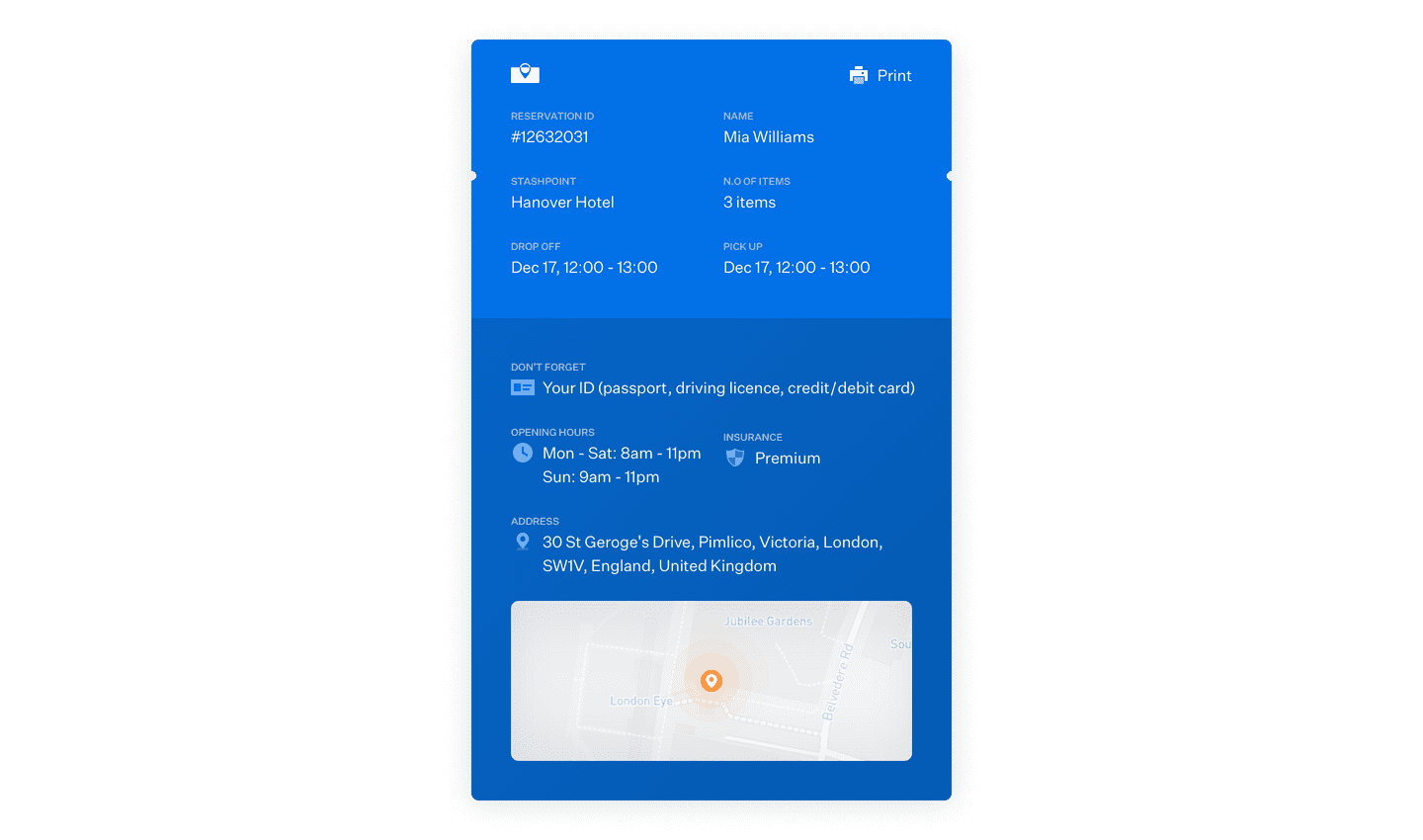
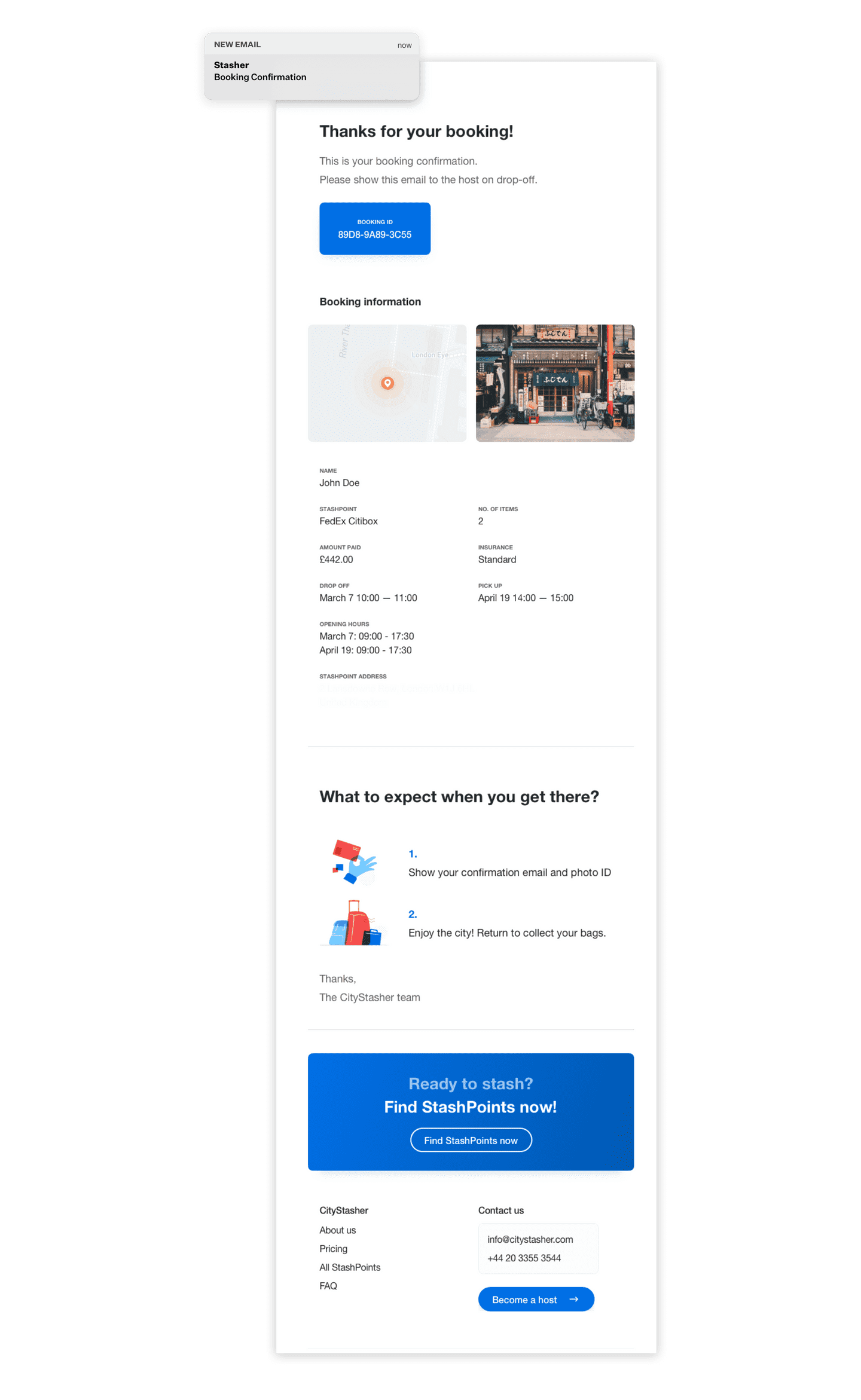
Booking Pass
Once a booking has been made, the most important interaction a customer will experience is when they go to actually drop off their bags.
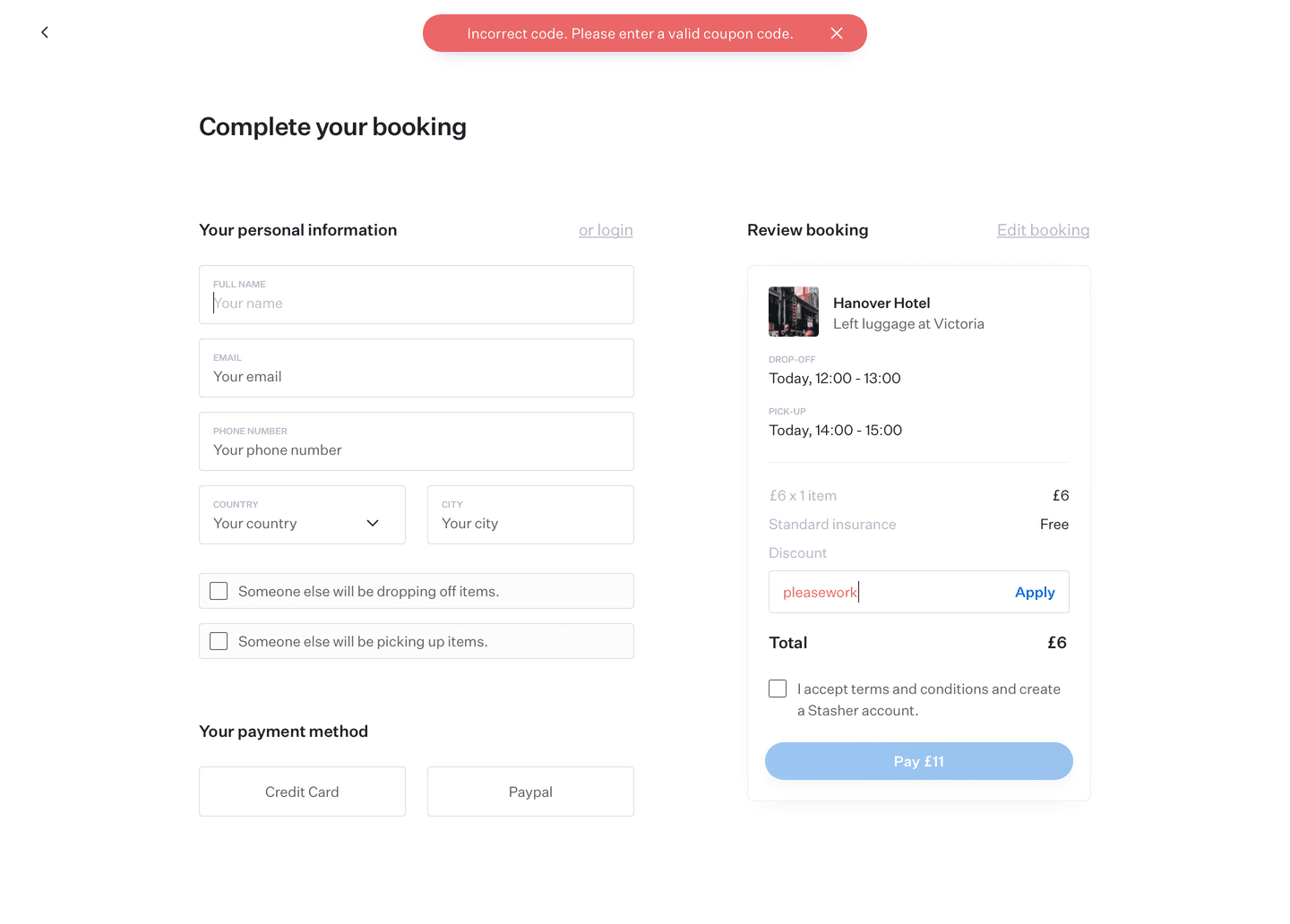
In an effort to reduce the potential friction and difficulty of this stage of the process, we created a page in the webapp (and in the email that customers receive upon booking) that very clearly shows the critical information that the StashPoint needs. In our case, this is the customer's booking reference and their name.
We took inspiration from airlines when designing this - they give you a booking pass with all the information that a member of staff needs at the gate, allowing you through as quickly as possible. By deliberately associating what we presented with the already familiar concept of a "booking pass", we allowed customers to feel confident that they knew exactly what to do when they arrived at a StashPoint for the first time.
This of course also allowed hosts to quickly check that a booking was valid and that the customer had indeed booked to store their bags.
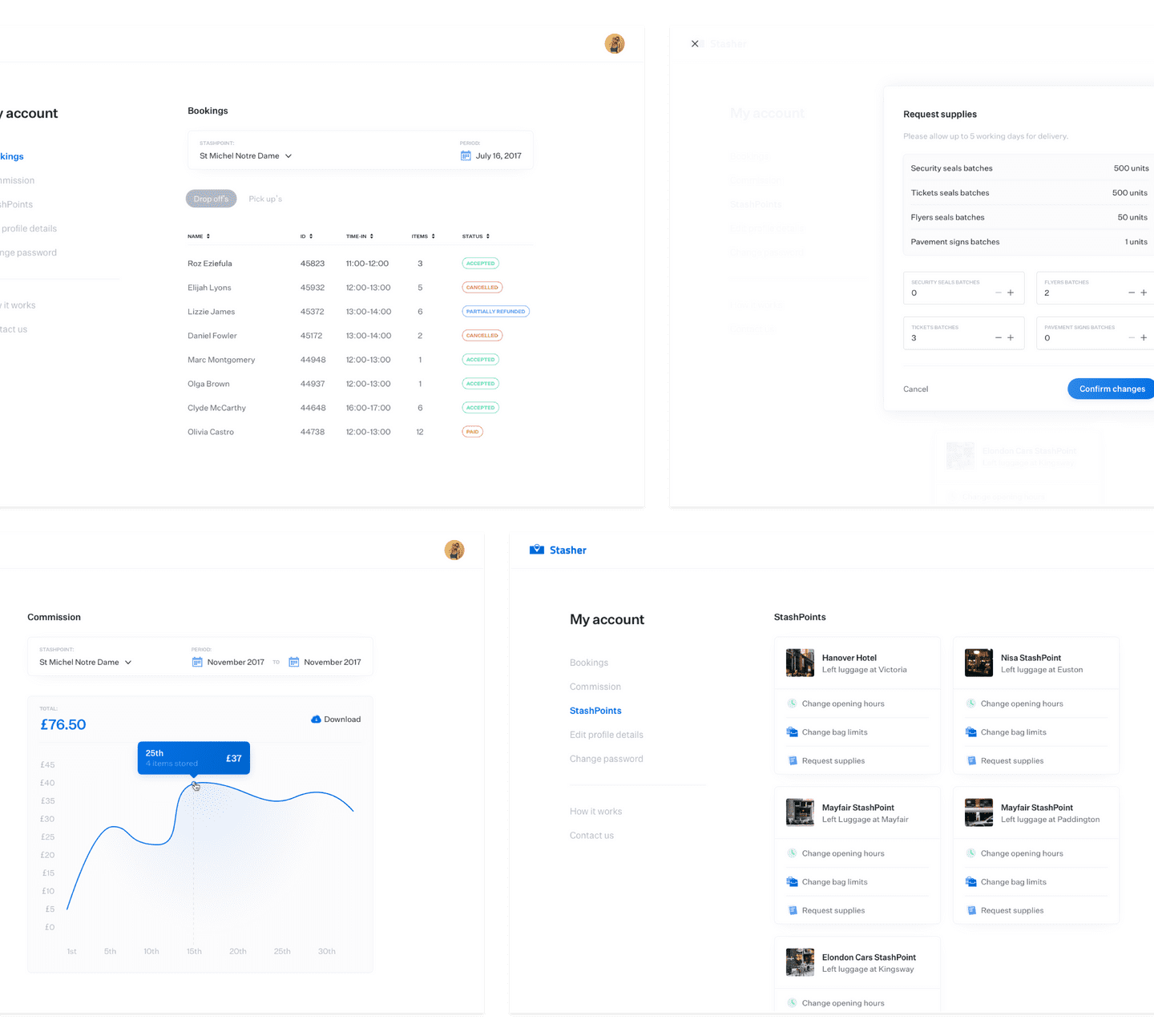
We applied this same logic to the information presented to hosts in the custom dashboard that we built for them. In their dashboard, they could see "at-a-glance" upcoming stashes and the associated identifying information. We found this to drastically minimise friction when a customer first arrived at a StashPoint.
Illustrations and Brand Identity
A fresh new brand identity was something that was discussed throughout the early design phases. This process also coincided with the rebranding from "CityStasher" into simply "Stasher", so we were given a wide remit to really explore what new branding and imagery could look and feel like.
In particular, we looked at exploring different colour pallets, with a focus on the "primary" colour. We knew that we wanted a new identity to portray trust, and several early concepts played with blues and purples. After extensive testing and feedback with user groups, we settled on a strong, deep blue. Studies have shown that blues have a calming effect, and portray trust.
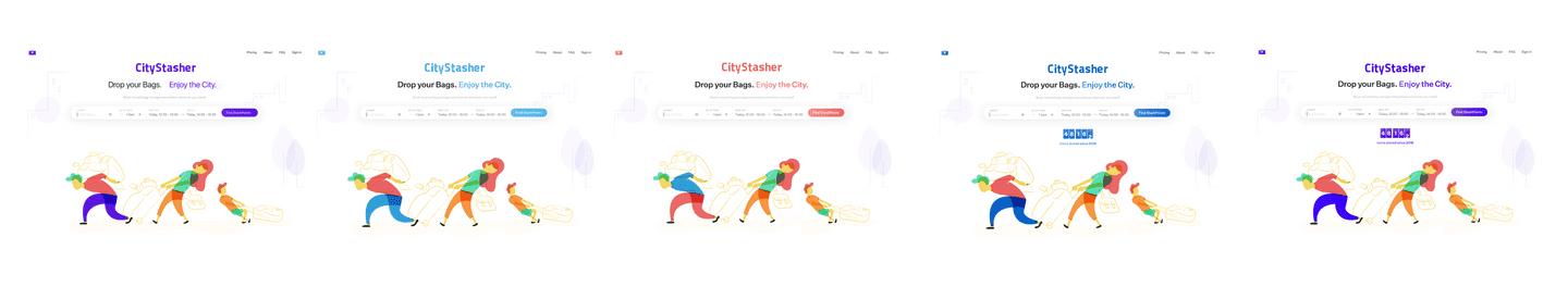
Illustrations were a key part of the visual design language. We wanted to create vibrant imagery that feels at home on the website itself, but could also be used across marketing channels - both online and offline - for a recognisable and distinct company identity.
We also wanted to show human motion and emotion that customers could relate to on their travels, for example, the lead image depicts people uncomfortably hauling heavy bags - something we can all relate to!

They are also fun, friendly, and playful (especially the child cheekily getting a ride to their destination!) to appeal to the mostly younger user base.
You can now find the illustrations on sandwich boards and shop windows in cities across the world outside StashPoints!
Final Designs
We were extremely happy with how the designs both function against the objectives and how visually recognisable they are - further validated by the usability testing we performed where users had a 100% task completion rate and rated the site as “very easy to use”.
Customer Interface
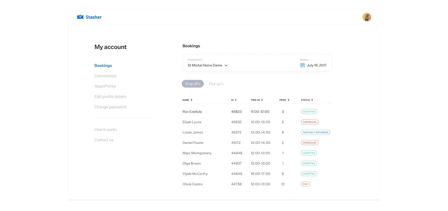
Host Interface
The host dashboard allows StashPoint operators to:
- View bookings for the day ahead
- View and download reports about their performance as a StashPoint and the income they can expect to receive
- Manage their account and details
- Order supplies such as luggage tags and physical advertising such as posters
Big Little Details
The small, hardly noticeable interactions are often the ones that separate a good product from a great one. As Charles & Ray Eames put it: “The details are not the details; they make the product”. We take pride in being thoughtful in our design of these small details.
Below, we've briefly highlighted a few that we're particularly proud of:
Opening Hours - Highlighting Today
Data that we'd collected about the behaviour of Stasher's users showed a clear bias for people booking a drop-off for the same day that they visited the site. Given that a key factor for a user choosing any particular StashPoint over another is the opening hours, we wanted to make finding information about opening hours for "today" easy by highlighting the current day among all of the others displayed.

Success and Failure Notifications
Visual feedback makes users feel in control. We wanted to clearly communicate the result of interactions and events that happened throughout the site. In most cases, this meant clearly reacting to button presses and showing feedback near the interaction itself. Sometimes, however, we needed to show that something had happened that wasn't necessarily caused by the user - for example if they'd lost network connection and couldn't book - and for this we used "toasts", little notifications that pop in somewhere on the screen, in our case from the top.
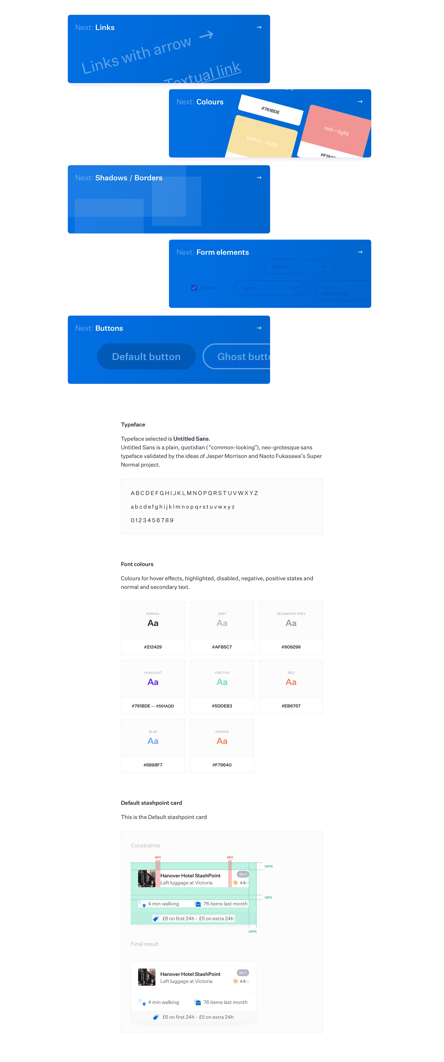
Style Guide
A really important objective for us was that Stasher would be able to carry on growing and succeeding after our formal relationship ended. A key aspect of this was creating a style guide for them. A style guide would act as a "source of truth" that ensured design consistency in anything new they created, be it page components or whole areas of the site.
Build
Once we had specced out what the product could look like from both a user-facing as well as a technical architecture perspective, it was time to bring the new Stasher website to life.
New Schema
A core concern pre-build was ensuring that their existing website and infrastructure could go on as it had been while we built the new platform. A key component of this was ensuring that we could migrate data on StashPoints, customers, and bookings from the existing database to the new one as quickly as efficiently as possible, ensuring minimal downtime of their operations at launch.
This was not trivial, as we had decided to take advantage of the opportunity presented to us in this "rebuild" to recreate their database schema from scratch.
The existing database was not built to purpose, as Stasher had been using a templated website (including database) and adapted it by adding on the fields they needed. By treating the new website as a "greenfield" project, we could ensure that we built them a database that would best support their operations now, and allow them to augment with ease going forwards.
A key difference in the new schema compared to the then current one was the concept of "Hosts". Previously, "Hosts" and "StashPoints" were indistinguishable, which led to difficulties when considering the growing number of "superhosts" - hosts that owned and operated more than one StashPoint.
By explicitly separating the encapsulation of Stasher's business relationships as "Hosts", and the physical locations as "StashPoints", we enabled functionality catered towards allowing these superhosts to exist, and made thinking about these two entities much more straightforward from a coding and reporting perspective.
Additionally, we could imbue these entities with different permission levels. For example, since we now had (from a database perspective) the idea of "Hosts" owning "StashPoints", we could associate different login levels with each. This meant that a company that Stasher had a business relationship with could log in and see how each of their franchise StashPoints were doing, and each physical location could have their own login that only let them see details on their own StashPoint.
Reservation ID
Having spent some time at a StashPoint observing the check-in and check-out process for both customers and hosts, one thing really stood out to us - customers tended to give their name and then read out the "Reservation ID" they'd been given at booking time. This ID was simply a string of 12 alpha-numeric characters.

This took some time.
Security of reservations was important to both Stasher and hosts, and one of the ways we guaranteed this was to make sure that hosts always check the reservation ID and customers' proof of identification against bookings made.
With that being said, we didn’t want to increase the time burden for either customers or hosts, so we considered how to best reduce the friction of this interaction whilst maintaining the ability to match against bookings.
Our solution was to leverage two facts about readability and the human brain:
- Long strings of unrelated (seemingly random) characters are meaningless. By "chunking", the string has a certain shape and cadence that is easier for the brain to process and remember. This is why you'll often see phone numbers expressed in chunks of digits.

This is significantly easy to scan or read (don't you think?) versus a string of meaningless characters with no separation.
Hosts were delighted with this change and said it significantly reduced hassle at check-in and check-out.
Search Typeahead Results
In the existing site, the first interaction that a potential customer would have was with the large central search bar (not unlike Google's homepage). This search bar is the user's primary way to find a place to stash their bags, and so formed a critical component of their overall journey.
Optimising this interaction was key to the overall successful conversion of users into customers.
"Optimising" in the context of StashPoint search meant two things to us:
- The user should be able to find a StashPoint in the place they were searching for quickly.
- The user should be able to clearly identify that they have chosen the correct place for them.
Before creating a solution, we knew that we needed to understand existing behaviour, partly to understand how we could improve the search experience in the new product, but also to validate that a basic solution (modelled on the existing site) had room for improvement and was a good use of our time to work on!
To understand existing behaviour, we tracked every search made on the site over the course of a couple of weeks, including location (if available), how many searches were conducted by the user, and if they eventually "converted".
This revealed a very clear bias towards users searching for train stations - particularly those that connected to National Rail. This was unsurprising given the value Stasher offer to people travelling into cities with their luggage, but having the confirmation in data was important to us.
Using this data, we designed a "typeahead" - where suggestions are given to you based on what you've already typed, again, a bit like Google - for the new site that prioritised and highlighted train stations. Not only did this mean that the most likely intention was sorted to the top, but by including icons representing the different types of suggestion (e.g. transport location, place of interest), we gave an extra data point for the user to be sure that they'd entered the correct location.
There was also an added bonus here of the business development (host sourcing team) using this information to build a picture of where best to target finding new hosts that customers want.
Map Providers
During the build phase we experimented with different mapping providers - primarily Google Maps and Mapbox - to identify which could give our users the best experience.
Initially, we particularly liked Mapbox, as it enabled us to do two things really well:
- Easily style the map using our own colour scheme in order to distinguish it significantly from sites that used default-style maps (usually provided by Google)
- Display the quickest way to walk from either their location - if they'd allowed location services - or their search location to the StashPoint
However, Mapbox had - in our opinion - a big limitation. Their search suggestions weren't as rich (from a metadata perspective) or intelligent as we'd been used to with Google's Places API. It seemed that Google were simply better at understanding the more frequently searched for locations, and prioritised them when returning results. This was important for our purposes, as almost all searches were for well-known locations.
Ideally, we would have used Google's search suggestions to power our typeaheads, and use Mapbox to display the map, but - unfortunately for us - it's against the terms of service of Google's Places API to use their search results if you don't intend to subsequently make use of Google Maps. Ultimately, we felt that speed and accuracy of the core results mattered more for the user experience than better looks and a “nice to have” feature, so after weighing up the positives and negatives of each option, we decided to use Google Maps.
Separation of Concerns
Part of our brief was to create a system that was capable of supporting the "core" webapp in addition to iOS and Android apps, as well as the potential for "widgets" to be hosted on channel partner sites. For us, this was a clear signal that we should create the backend and frontend completely separately from a technical perspective, and expose the functionality we required from the backend to the frontend via an API.
Integrating with Third-Party Tools
There were many functionalities that it didn't make sense to build ourselves, so - like the vast majority of modern products - we took advantage of several third-party services. There were three key parts of the product that would benefit from such integrations:
Analytics
Understanding the customer's journey through the product is critical in order to iterate and improve a product. We used Mixpanel to understand user behaviour, primarily to understand where (if anywhere!) the customer dropped off while booking a “stash”. We were also able to understand how the user behaves on mobile when compared to desktop, and segment users based on various heuristics.
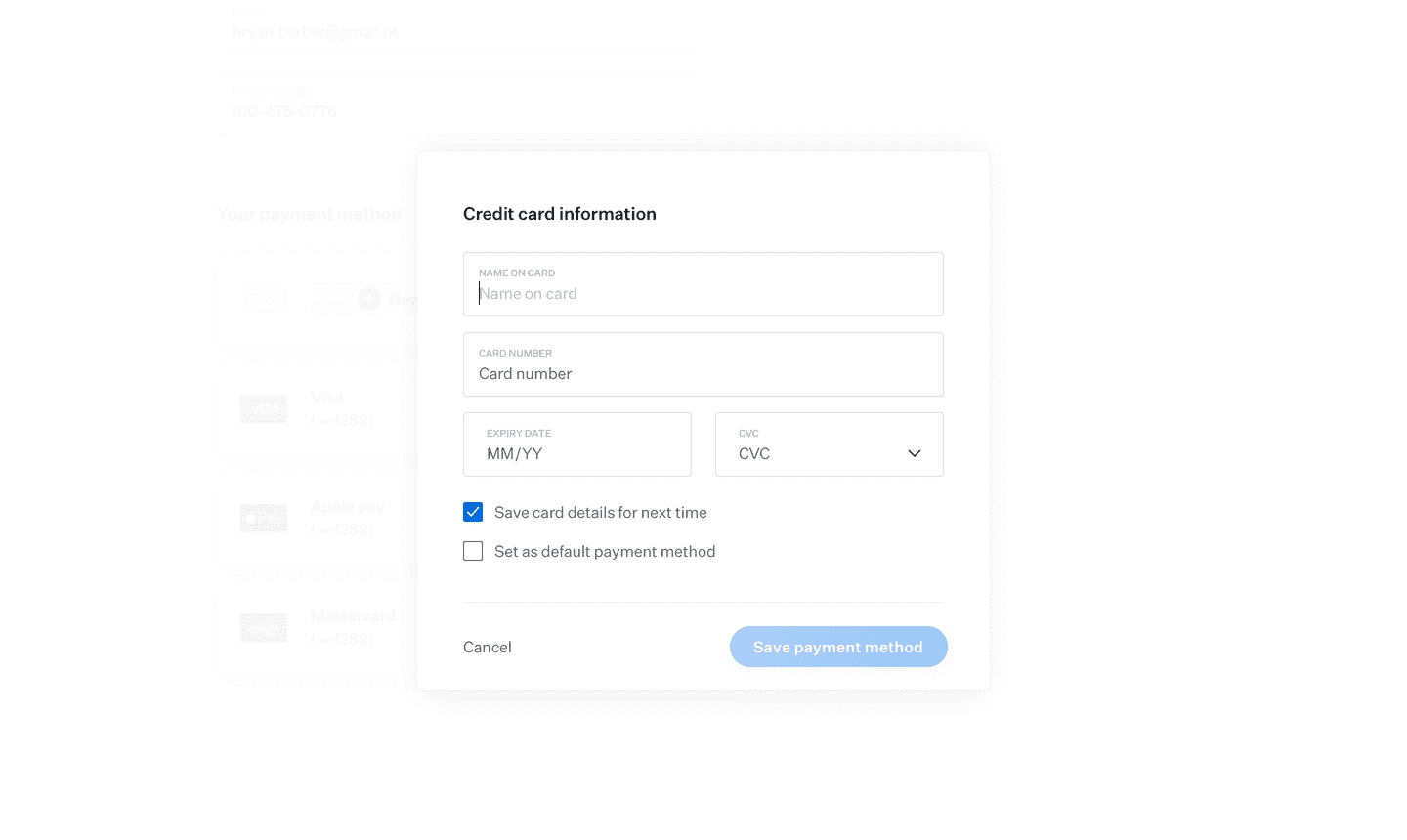
Payment
Implementing safe, secure, and reliable financial functionality is not something to be undertaken lightly, in part due to the fact that there is a lot of regulation to consider if you were to create your own payment solution. As such, we used an industry-leading third-party solution, namely Stripe.
Stripe has a notoriously good developer experience so the decision to use Stripe was the easiest we made in the entire process!
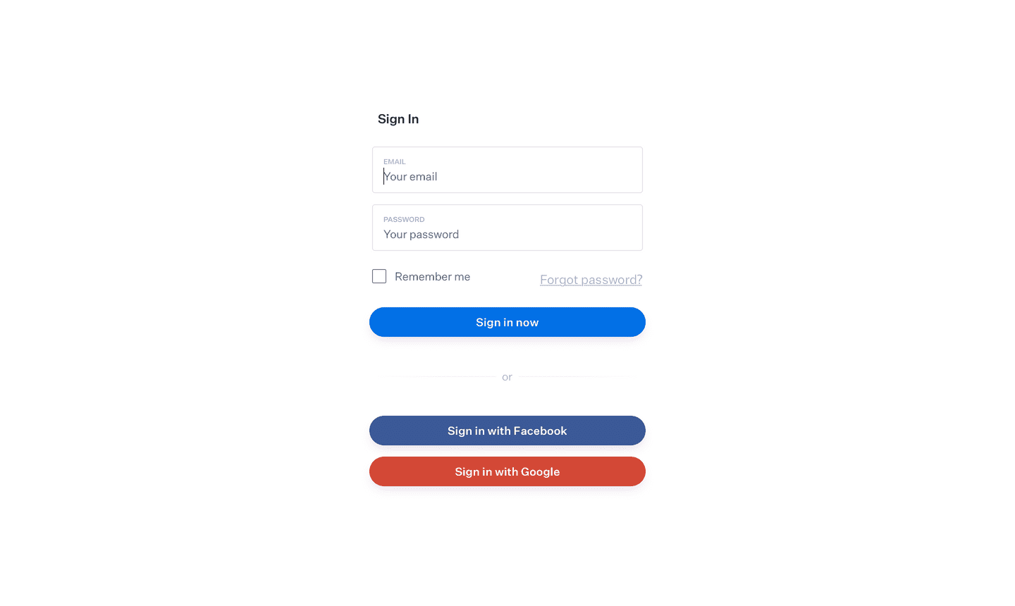
Social Login
One of our early steers was to make the booking process as simple as possible end-to-end, and an easy way to reduce friction for users was to make account creation (necessary for making a booking) as simple as possible. We achieved this partly through our design of the sign up / sign in process, but also by including the ability to create an account or log in via Facebook or Google - reducing account creation to a single button press in many cases.
Being able to email users was important to Stasher in order to run marketing campaigns, but was also important to contact users about the stashes they were booking. For example, emailing their booking confirmation to them, sending them "password reset" emails, etc.
Our task was to find an email solution that would allow the marketing campaign email to be templated and sent out, as well as allow the "transactional" emails (those triggered by events such as booking) to be templated and triggered from the backend system. Mailchimp / Mandrill allowed us this exact blend.
Content Management System
In order to make it easy for anyone in Stasher to change content we set up and implemented a simple to use third-party content management system. We chose to use a headless CMS, as that meant that content is available across all platforms, rather than being completely coupled to a specific website solution. The release scheduling functionality also helped speed up the flow of bringing hosts onboard, as information could be uploaded piece by piece with a preview to see what was outstanding, and then published when the operations team gave the green light.

Internationalisation
One of the key features in the new webapp in order to grow the business in the future - especially given how quickly Stasher were expanding globally - was to have it be multi-language and multi-currency.
We implemented full language internationalisation and localisation for both text and images across the entire site, ensuring that travellers from all over the globe would be able to easily take advantage of the service that Stasher offered.
Being an international site also meant supporting multiple currencies when booking a stash. In the backend, we stored the price of a stash on a per-item basis in the currency (as an integer value representing each currencies minor units, to avoid float precision errors) of the country that the StashPoint was located in, and then presented an estimated figure in each user's chosen currency.

Management Information Dashboards
We worked with Stasher to build a dashboard for them and their investors to allow them to track their key performance indicators, and generally allow them to have an at-a-glance view of their business, which we implemented using Redash.
We also implemented Mixpanel and Google Analytics to track how users interact with the application, and to give us a sense of where to focus future efforts in order to increase conversion and retention.
Along with basic analytics such as page-views, location of users, browsers, devices, etc., we also set up more granular tracking and alerting relating to of a user's journey, such as:
- abandoned carts
- instances where a user makes lots of searches, which would indicate that a StashPoint either wasn't available or wasn't easy to find
- conversion funnels that allowed us to work out where in the booking process users were dropping off

Results & Awards
Since working with Stasher they have gone from strength to strength raising £850k investment, increasing revenue by 300% in 6 months, and winning a number of prestigious awards.
In 2018, Stasher won Expedia’s inaugural Travel Startup Competition, Travolution’s Startup of the Year, VRTech’s Startup of the Year, Visit England’s Award for Excellence, Feefo’s Gold Service Award, Phocuswright’s People’s Choice Award and Pitch@Palace.